ShopDreamUp AI ArtDreamUp
Deviation Actions

Early Comics
3 Subscribers
Thanks for helping me keep making comics! you get to see the comics earlier (about 5 days earlier) and for every 6USD, you have the right to ask Rayah a wish!
$1/month


Suggested Deviants


Suggested Collections


You Might Like…


Featured in Groups


Description
Yay! I feel like this is the issue where things start to pick up!
Too bad I'll probably just be updating once a week. Doing these twice a week was just killing me with the sleep deprivation :/
Next page
Next issue
Previous issue
Too bad I'll probably just be updating once a week. Doing these twice a week was just killing me with the sleep deprivation :/
Next page
Next issue
Previous issue
Image size
700x902px 335.98 KB
Comments8
Join the community to add your comment. Already a deviant? Log In
Heyyyyyy, I know you!
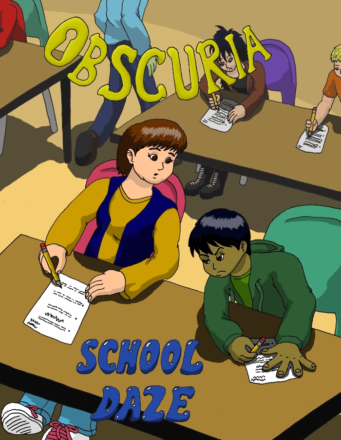
Anyway, getting right to business, I would say that the drawing here is mostly there. The characters' expressions are realistic and their emotions obvious. Nothing about each individual character looks particularly unnatural. I would suggest focusing on arrangement of various objects on the page. The perspective is slightly stilted - look at the angle of the table in front compared to the ones in back. Personally, I like to do straight lines with a one-point perspective - you start from one point and all straight lines radiate away from it. (In your case, this would be off the page, but that could easily be solved by just starting with a large canvas and putting the point wherever you want, then cropping once you have the lines all set.) Also, the characters' sizes are uneven; it looks like the girl at the front table is about twice as tall as the people behind her. Your shading is mostly accurate in positioning and is not excessively light or dark, but I would suggest making them more detailed in some places - namely, the one of the person walking doesn't resemble the shape of his body. Also, center the text, and personally I'd use a font instead of hand-drawing it (I know what you said about sound effects, but a little more cleanliness is expected for a cover).
(Sent here from #projectcomment)